A New Look For A New Phase: The Story Behind SUP Racer’s New Logo
![]()
Welcome to the next phase of SUP Racer. Today we reveal the new look logo, however this is just the first of many changes you’ll see over the coming weeks and months.
I started SUP Racer three and a half years ago as a simple hobby. Back then I was frustrated at having no single site where I could find all the results, rankings, schedules and other essential info from the SUP racing world. There were, and still are, many other great stand up paddling blogs and news sites out there. However back then, nobody was focusing purely on the racing side of our sport, which is where my stats-geek mind has always been clearly focused.
Ever since I was a kid, I’ve always loved analysing the numbers of sport. Knowing the results as soon as the winners crossed the line, comparing athletes against each other on an accurate world rankings leaderboard, pouring over the stats and all the other insights you can only get from going beyond the words and looking at the raw data itself. You could say I’m mildly obsessed…
This is what’s driven me to update this site almost every 24 hours for the past 1,224 days, and it’s what will drive me and, soon, my new SUP Racer team to keep pushing forward and helping promote the amazing athletes, the excellent events and the trusted brands that make our sport so great. For both the good of the sport and for our own personal enjoyment and satisfaction, SUP Racer will soon be more active and involved in the world of SUP racing than ever before.
When I began this site, I built it from day one as the site that I wanted to read myself. I didn’t even know if anybody else would bother visiting. Back then I just kinda hoped somebody else cared as much about this sport as I did…
Fortunately, SUP Racer has grown at a rapid pace since late 2011 and we now get over one million visits a year. There are way too many people to thank for where SUP Racer is today, and for the ridiculously fun lifestyle it’s given me, though a special mention goes to Jamie Mitchell, Travis Grant and Paul Jackson, who gave me priceless information and introductions in the first few months.
There will be a whole lot of very cool changes over the next several weeks, the first of which is our new logo.
The old SUP Racer logo was thrown together in about five minutes by me. It wasn’t even a logo, it was just the site’s name written using a half decent font…
This new logo is a LOGO.
Designed by the very talented @thegirlfromsupanema, we went through dozens of iterations before I found the one I wanted. The one that symbolised exactly what SUP Racer is all about.
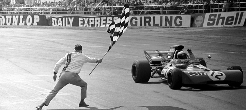
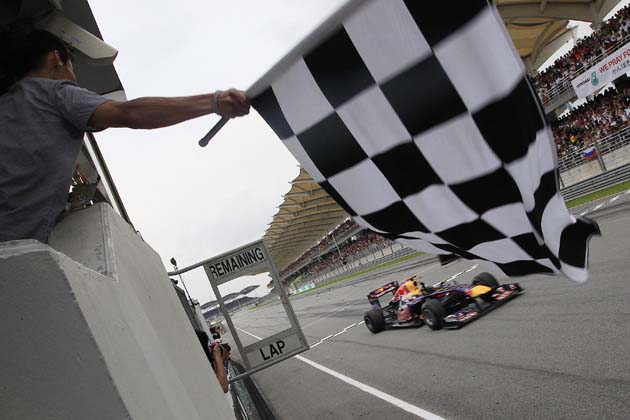
The new SUP Racer logo is inspired by the classic chequered flag, which is traditionally waved as the winner crosses the line in motorsports.
The chequered flag (or “checkered”) has a long history in the racing world. Steeped in history, the earliest known photo dates back to 1906, with cycling, horse racing and motorsports all using it at one point. Over the past hundred years, this flag has become a symbol of victory at the most prestigious races around the world, particularly Formula 1
This checkered pattern symbolises exactly what SUP Racer is all about. While I do try and give our entire sport plenty of coverage on these pages, from the small local races featuring weekend warriors right up to the international headline events, my passion clearly lies with analysing and critiquing the elite side of stand up paddle racing. So having a logo that embodies “victory”, “prestige” and “racing” is exactly what I wanted.
It’s subtle, and it might not be noticeable on the first take, however this chequered flag pattern is at the very heart of our new logo.
It’s a new logo and a new look for a new phase.
The past 1,224 days have been a crazy ride, here’s to the next 1,224…
![]()
You must be logged in to post a comment.